Case Study
✦
Case Study ✦
Advokado
Law services cool again.
Redesigned with users in mind.
— User Experience (UX)
— User Interface (UI)
— Brand Design
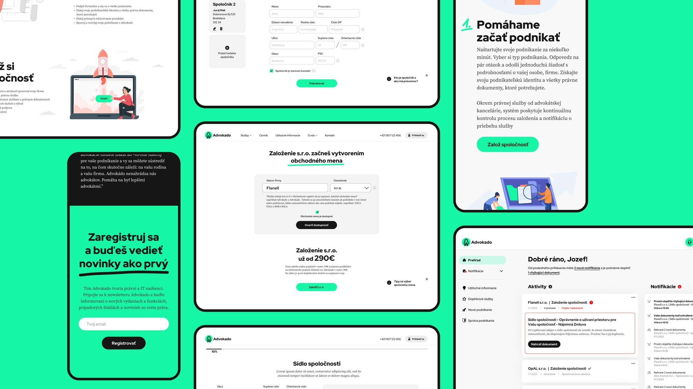
We partnered up with Advokado to help them design their MVP – a company set-up tool with full legal support. It had to be as user-friendly as possible, with no up-front paperwork required.
The Partner
Advokado is a 100% online law firm with full legality and no cut corners. It is a one-stop-shop platform for all things legal a business may need.
Everything is backed by a group of professional business lawyers who also personally advise Advokado users.
The Mission
Advokado needed superb user experience for their MVP – a company set-up tool. With the technical and legal side covered, they asked us to step in with the design.
The challenge was to keep the UX smooth while meeting all the rigid legal requirements – a no-small feat, considering all the required paperwork the user needs and the inevitable flow interruptions that come with it.

The goal was clear: Reach an MVP where users can set up their company without ever leaving the couch. Any paperwork must come later.
Our approach
We divided the tasks into 3 stages.
1. Create a structure
We drafted the wireframes and tweaked them following all the legal requirements at hand.
This meant a lot of research at first – either the competition or all the best practices in the legal sphere.
2. Craft a Brand
With no brand to speak of, we integrated with the Advokado team to develop something unique, unpretentious, and functional.
3. Collate both
Finally, we applied the brand design to the structure – creating the visuals for Advokado’s MVP.
The result – a company set up in 5 simple steps, taking up no more than 7 minutes. All that’s left is uploading the required documents – later, in peace, never breaking the flow.

The Advokado MVP launches soon. We can’t wait!
In the meantime, check out the website.
“ With Advokado, we knew we wanted a product that would do things right without cutting any legal corners. However, we feared the UX would not solve any frustrations our clients had, thus killing the point. Panaxeo created a streamlined user flow for us. Setting up a company via Advokado is now both legally bulletproof and easy as pie.”
Igor Ribár
Co-founder | Advokado.sk
Tech Stack
_____
Miro Board
effective communication with the client in real-time.
_____
Figma
design and its iterations.
This case study was created in November 2022 by Panaxeo.


